Government of Canada Fisheries & Oceans Redesign
FROM
COMPLEXITY
TO CLARITY.
Redesigning complex government information around how users actually search and navigate.
THE PROBLEM
The information was there.
Finding it was the problem.
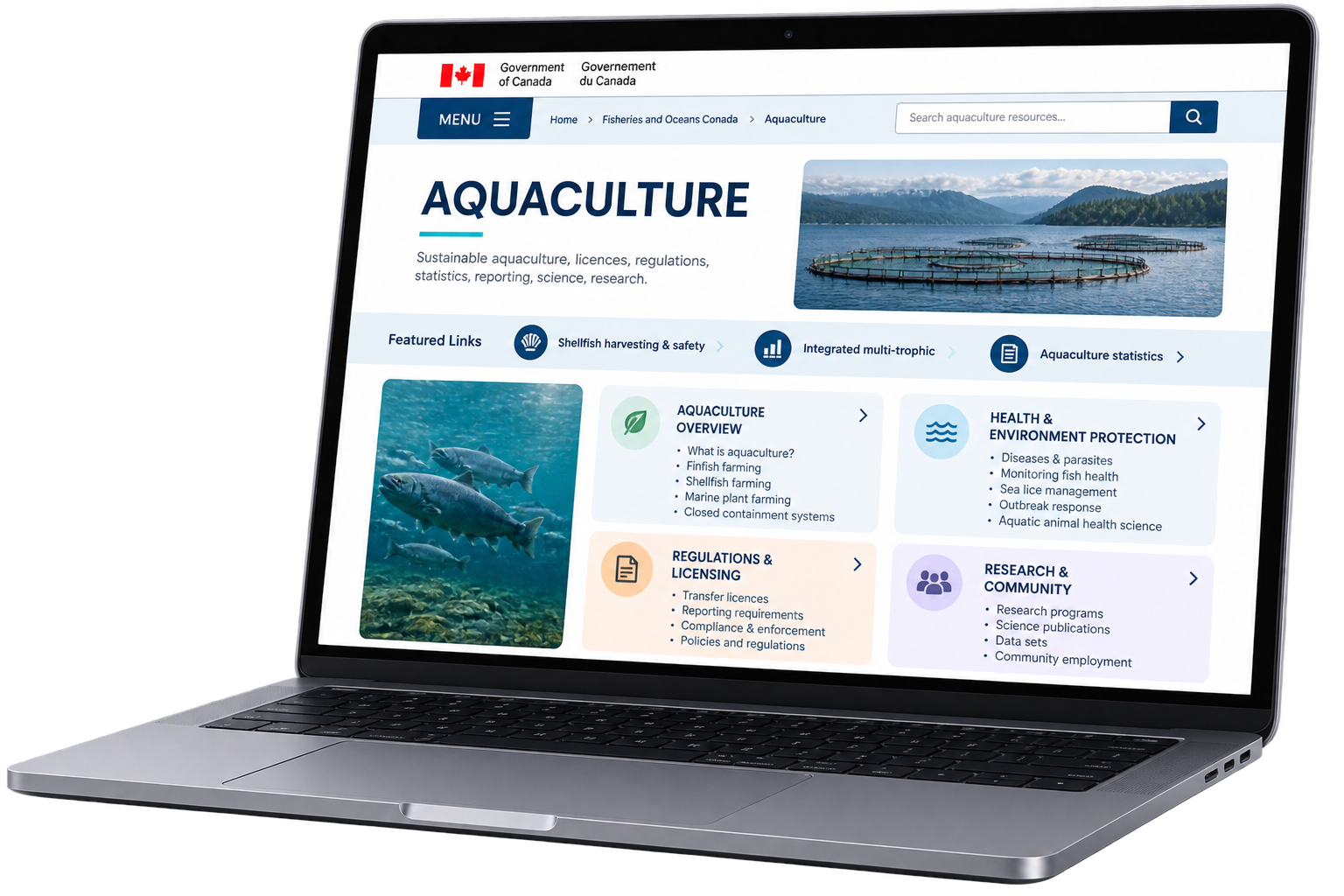
Our initial content review revealed an information-heavy website with deep navigation, overlapping topics, technical terminology and inconsistent presentation. Important information often existed, but users had to navigate several levels to find it.
TOO DEEP
Important information was buried several levels down
TOO SCATTERED
Related information appeared across different sections.
TOO TECHNICAL
Labels didn’t always match the language users expected.
TOO INCONSISTENT
Pages lacked a clear, predictable structure.
EXSISTING STRUCTURE REVEIW
Understanding what we’re working with.
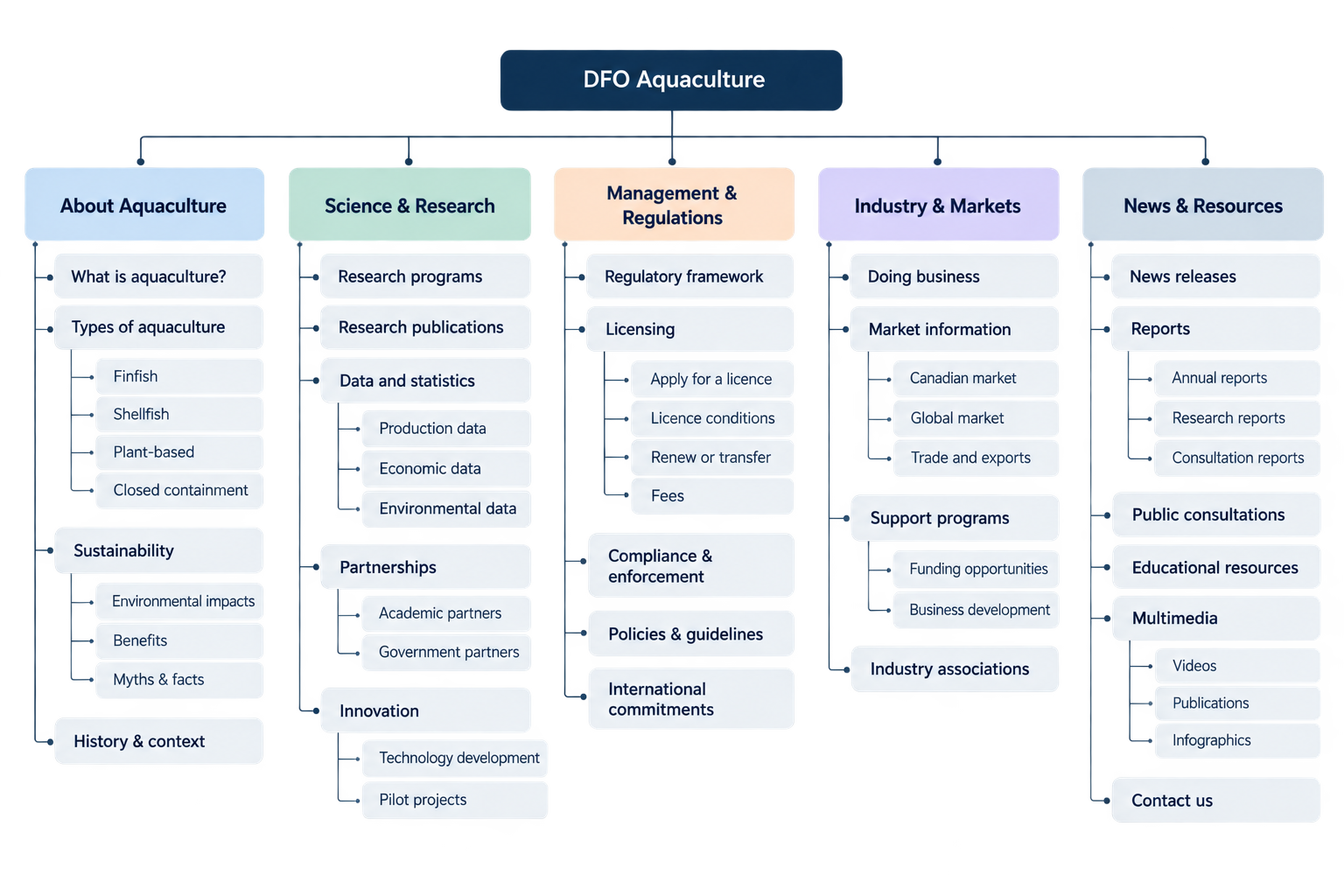
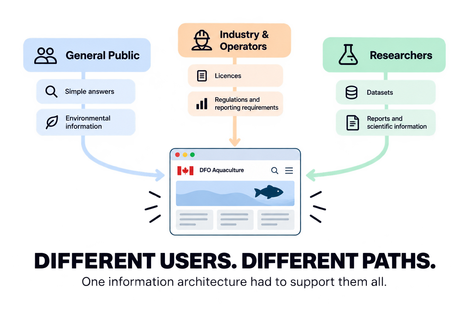
Before redesigning the information architecture, we mapped the existing DFO Aquaculture website to understand its content, hierarchy and how different users searched for information.
CARD SORTING
How would users organize it?
To understand how users naturally organized aquaculture information, we conducted a digital card sort with 12 participants. Their groupings helped reveal which topics belonged together and which labels felt most intuitive.

12
PARTICAPANTS
Sorted aquaculture topics into categories that made sense to them
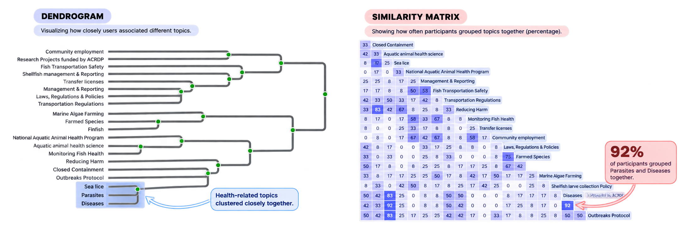
CARD SORTING INSIGHTS
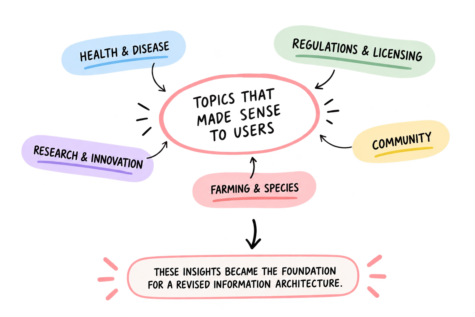
Users organized
content by meaning,
not government
structure.
TREE TESTING
WOULD THE NEW STRUCTURE ACTUALLY WORK?
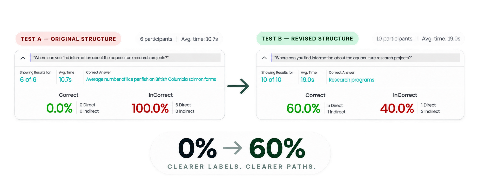
We tested the original information architecture against a revised version informed by our card sorting findings. Participants completed the same research-finding task to see whether clearer labels and groupings improved navigation.
TREE TESTING INSIGHTS
Clearer but not perfect.
Tree testing showed where the revised structure improved navigation and where further refinement was still needed.
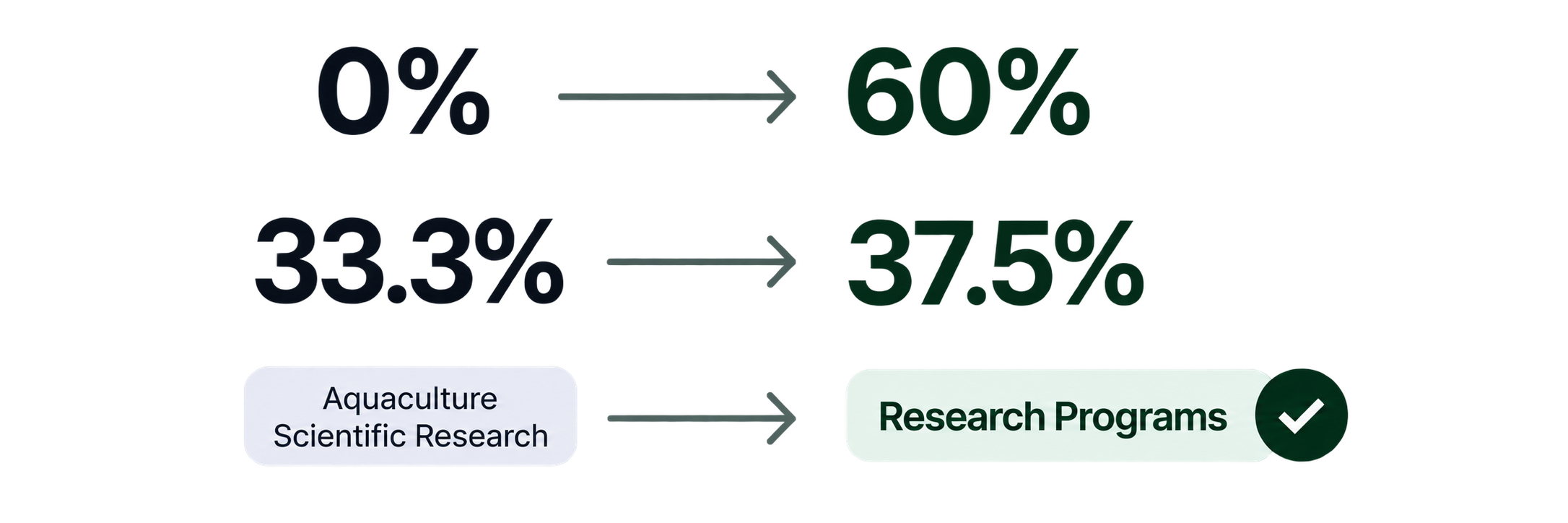
RESEARCH BECAME EASIER TO FIND
Clearer research labels created a more intuitive path to the right content.
HEALTH STILL CAUSED CONFUSION
The smaller improvement showed that health-related categories still needed refinement.
LABELS MATTERED
Clearer terminology made the destination easier for users to predict.
FINAL INFORMATION ARCHITECTURE
From complexity to clarity.
Using insights from the content inventory, card sorting and tree testing, we refined the information architecture around clearer categories, more intuitive labels and more direct paths to content.
WHAT CHANGED
CLEARER CATEGORIES
Related information was grouped around reconizable topics.
SIMPLER LABLES
Technical language was replaced with more intuitive terminology.
MORE DIRECT PATHS
Important content required fewer decisions to find
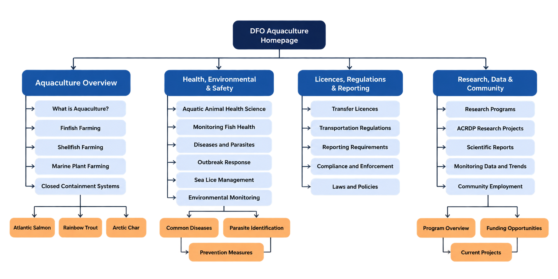
RESEARCH → STRUCTURE → EXPERIENCE
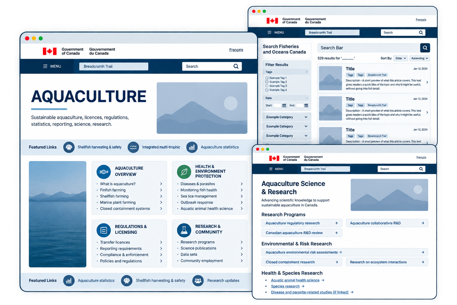
WIREFRAMES
Turning structure into experience.
With the information architecture established, we translated the new structure into wireframes to explore how users could navigate, search and access key aquaculture information.
We tested → We found problems → We changed the design.

THE STRUCTURE BECAME THE EXPERIENCE.


REFLECTION
GOOD NAVIGATION
STARTS BEFORE
THE INTERFACE.
TEST, DON'T ASSUME
Testing showed what improved navigation and what still needed refinement.
WORDS MATTER
Clearer labels helped create more predictable paths through complex information.
RESEARCH BEFORE REDESIGN
Understanding users first gave our design decisions direction.