Region of Waterloo
Better Together: Digital Services Playbook
A centralized Digital Services Playbook designed to help Region of Waterloo staff create clearer, more consistent and accessible digital services.
THE PROBLEM
Same services.
Different experiences.
Staff lacked centralized guidance, creating inconsistent processes and digital experiences.
Goal
Make service guidance easier to find, understand and use.
Inconsistent
design

Unclear
labels

Scattered
guidance

More work
for staff

RESEARCH
Understanding the experience.
Interviews
We spoke with stakeholders to understand project goals, needs and expectations.

Contextual Observation
We observed residents completing common tasks on the Region of Waterloo website.
UX Audit
We reviewed the website for usability, accessibility, clarity and findability.
Comparative Analysis
We compared the experience against recognized digital service standards.
KEY FINDINGS
What we learned.

Better resident experiences start with better staff experiences.
Our research showed that improving the resident experience was not only about changing what residents saw on the website.
Staff also needed clearer tools, guidance and shared standards behind the scenes.
Residents wanted answers quickly and were focused on completing tasks.
Search was often preferred over navigating through menus.
Important information could be difficult to find.
Unclear form fields created hesitation and confusion.
Staff lacked centralized guidance and standardized workflows.
DESIGN PROCESS
Turning Research into a solution.
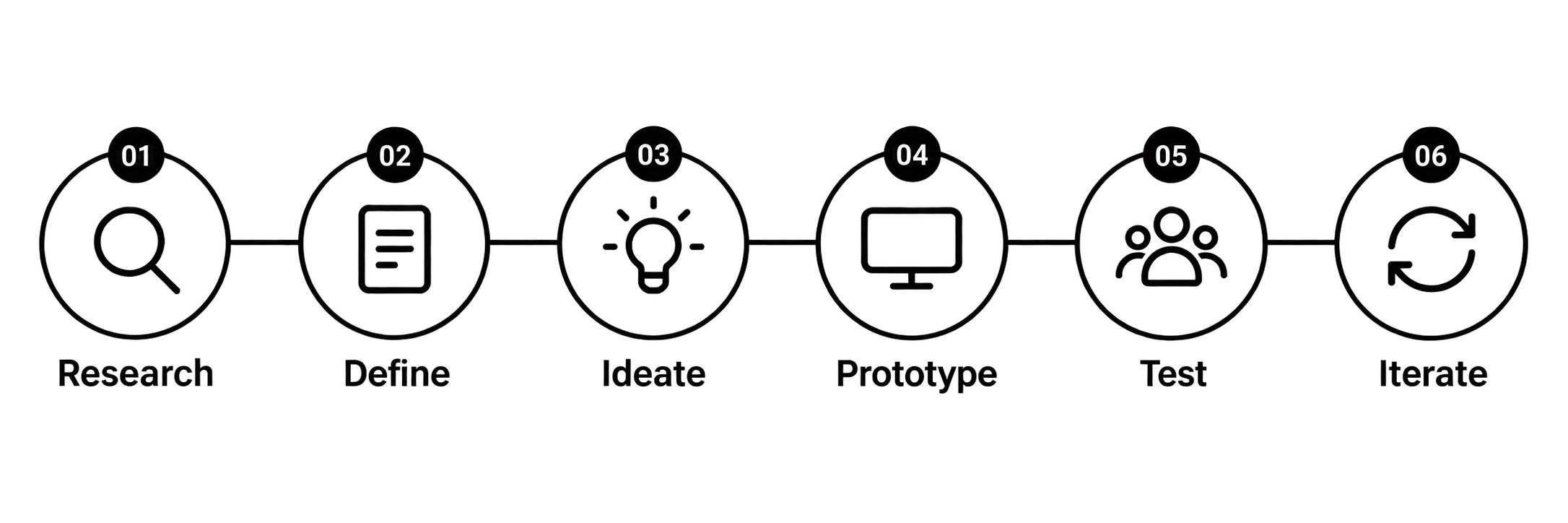
We followed a user-centred design process and focused our prototype on the complaint experience, one of the main service-design pain points identified during the project.
Understand
Needs
Identify problems
Explore solutions
Build in Figma
Validate with users
Refine the design
THE SOLUTION
One playbook. Better services.
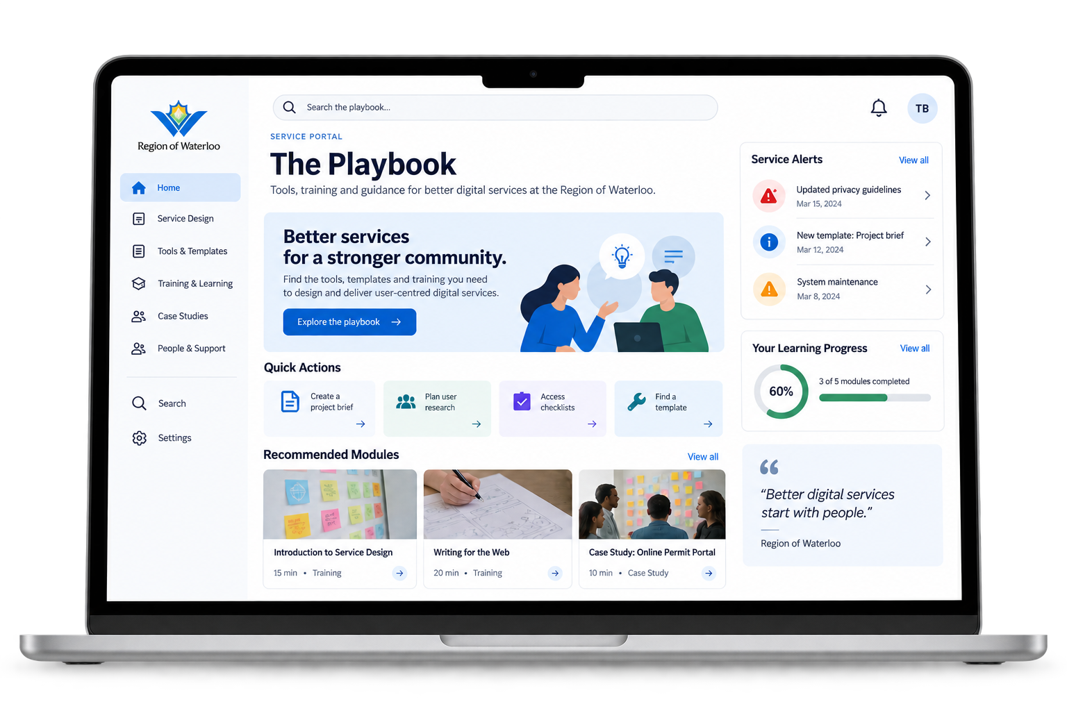
Access common staff tasks quickly.

Find tools and information faster.
Learn practical service design best practices.
Use shared resources for consistent services.
TESTING & ITERATION
Real feedback.
Real improvements.
We tested the prototype with three users with different levels of experience and asked them to locate and log a resident complaint.
We tested → We found problems → We changed the design.
WHAT WORKED
✓ Quick Actions easy to find
✓ Sidebar supported browsing
✓ Search helped new users
WHAT NEEDED IMPROVEMENT
✕ Similar actions caused confusion
✕ “Toolbox” wasn't obvious
✕ Users expected different locations
IMPACT
Creating consistency from the inside out.
BUILDS STAFF CONFIDENCE
IMPROVES CONSISTENCY
REDUCES FUTURE ERRORS
SAVES TIME LONG-TERM

REFLECTION
Designing For People. Not Just Products.
This project taught me that improving the resident experience can start behind the scenes. I learned how research, collaboration and usability testing can turn complex service problems into practical design decisions.